
4
scoped解决样式冲突
默认情况:
写在组件中的样式会 全局生效 → 因此很容易造成多个组件之间的样式冲突问题。
-
全局样式: 默认组件中的样式会作用到全局,任何一个组件中都会受到此样式的影响
-
局部样式: 可以给组件加上scoped 属性,可以让样式只作用于当前组件
代码演示
BaseOne.vue
<template>
  <div class="base-one">
    BaseOne
  </div>
</template>

<script>
export default {

}
</script>
<style scoped>
</style>
BaseTwo.vue
<template>
  <div class="base-one">
    BaseTwo
  </div>
</template>

<script>
export default {

}
</script>

<style scoped>
</style>
App.vue
<template>
  <div id="app">
    <BaseOne></BaseOne>
    <BaseTwo></BaseTwo>
  </div>
</template>

<script>
import BaseOne from './components/BaseOne'
import BaseTwo from './components/BaseTwo'
export default {
  name: 'App',
  components: {
    BaseOne,
    BaseTwo
  }
}
</script>
scoped原理
- 当前组件内标签都被添加data-v-hash值 的属性
- css选择器都被添加
[data-v-hash值]的属性选择器
最终效果: 必须是当前组件的元素, 才会有这个自定义属性, 才会被这个样式作用到

data必须是一个函数
data为什么要写成函数
一个组件的 data 选项必须是一个函数。目的是为了:保证每个组件实例,维护独立的一份数据对象。
每次创建新的组件实例,都会新执行一次data 函数,得到一个新对象。
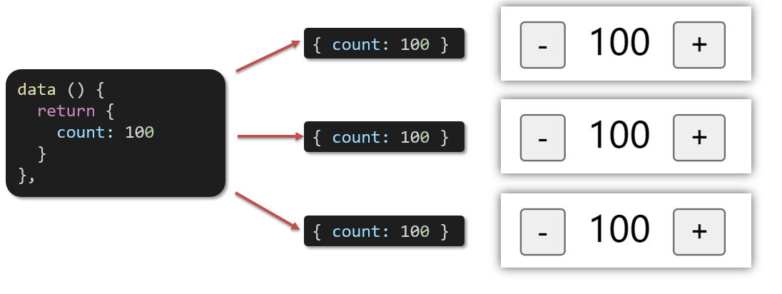
代码演示
BaseCount.vue
<template>
  <div class="base-count">
    <button @click="count--">-</button>
    <span>{{ count }}</span>
    <button @click="count++">+</button>
  </div>
</template>

<script>
export default {
  data: function () {
    return {
      count: 100,
    }
  },
}
</script>

<style>
.base-count {
  margin: 20px;
}
</style>
App.vue
<template>
  <div class="app">
    <BaseCount></BaseCount>
  </div>
</template>

<script>
import BaseCount from './components/BaseCount'
export default {
  components: {
    BaseCount,
  },
}
</script>

<style>
</style>
组件通信
什么是组件通信?
组件通信,就是指组件与组件之间的数据传递
- 组件的数据是独立的,无法直接访问其他组件的数据。
- 想使用其他组件的数据,就需要组件通信
组件之间如何通信
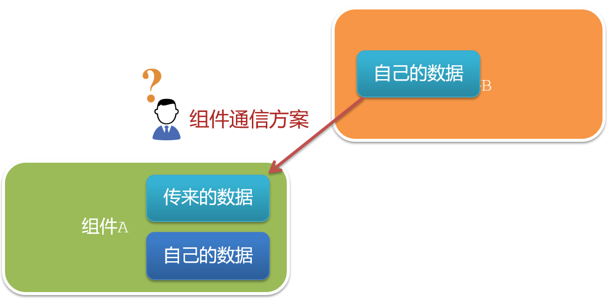
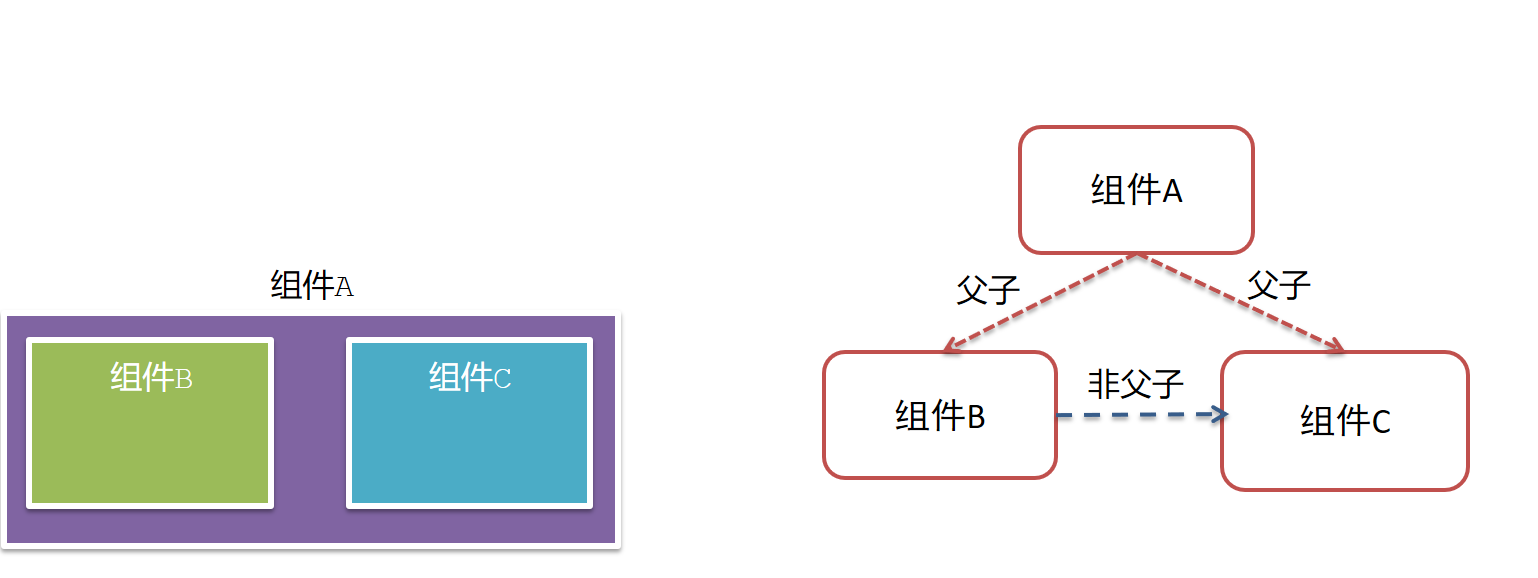
组件关系分类
- 父子关系
- 非父子关系
通信解决方案
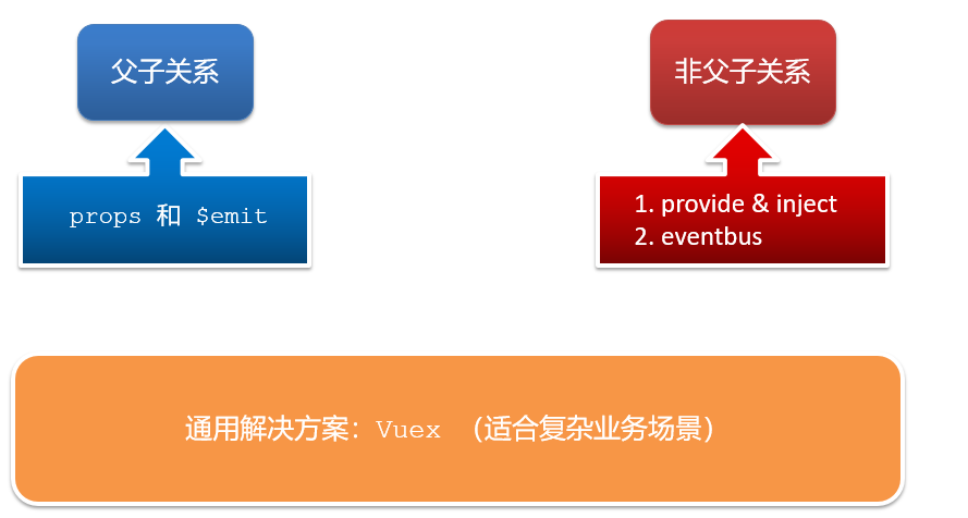
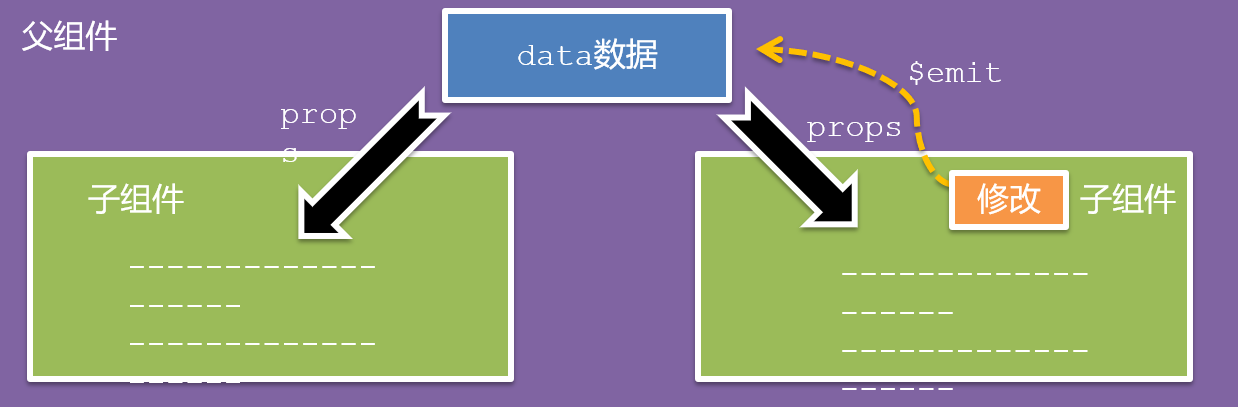
父子通信流程
- 父组件通过 props 将数据传递给子组件
- 子组件利用 $emit 通知父组件修改更新
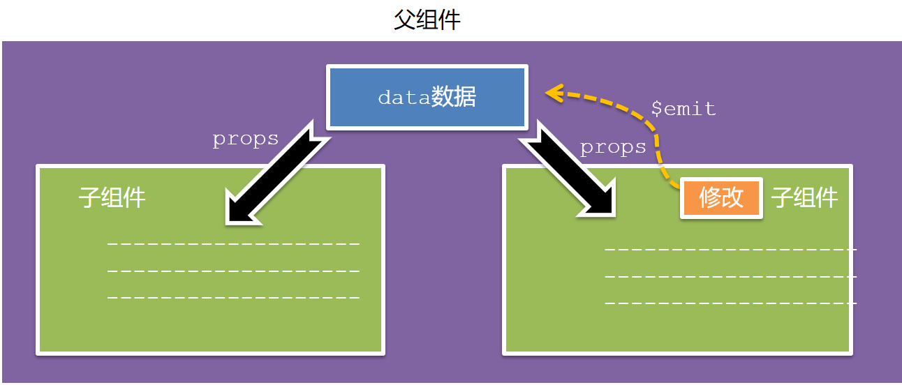
父向子通信代码示例
父组件通过props将数据传递给子组件
父组件App.vue
<template>
  <div class="app" style="border: 3px solid #000; margin: 10px">
    我是APP组件
    <Son></Son>
  </div>
</template>

<script>
import Son from './components/Son.vue'
export default {
  name: 'App',
  data() {
    return {
      myTitle: '学前端,就来黑马程序员',
    }
  },
  components: {
    Son,
  },
}
</script>

<style>
</style>
子组件Son.vue
<template>
  <div class="son" style="border:3px solid #000;margin:10px">
    我是Son组件
  </div>
</template>

<script>
export default {
  name: 'Son-Child',
}
</script>

<style>

</style>
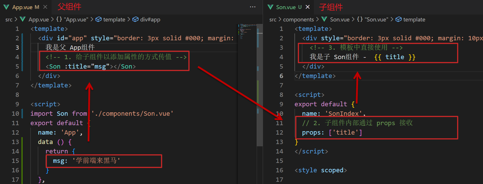
父向子传值步骤
- 给子组件以添加属性的方式传值
- 子组件内部通过props接收
- 模板中直接使用 props接收的值
子向父通信代码示例
子组件利用 $emit 通知父组件,进行修改更新
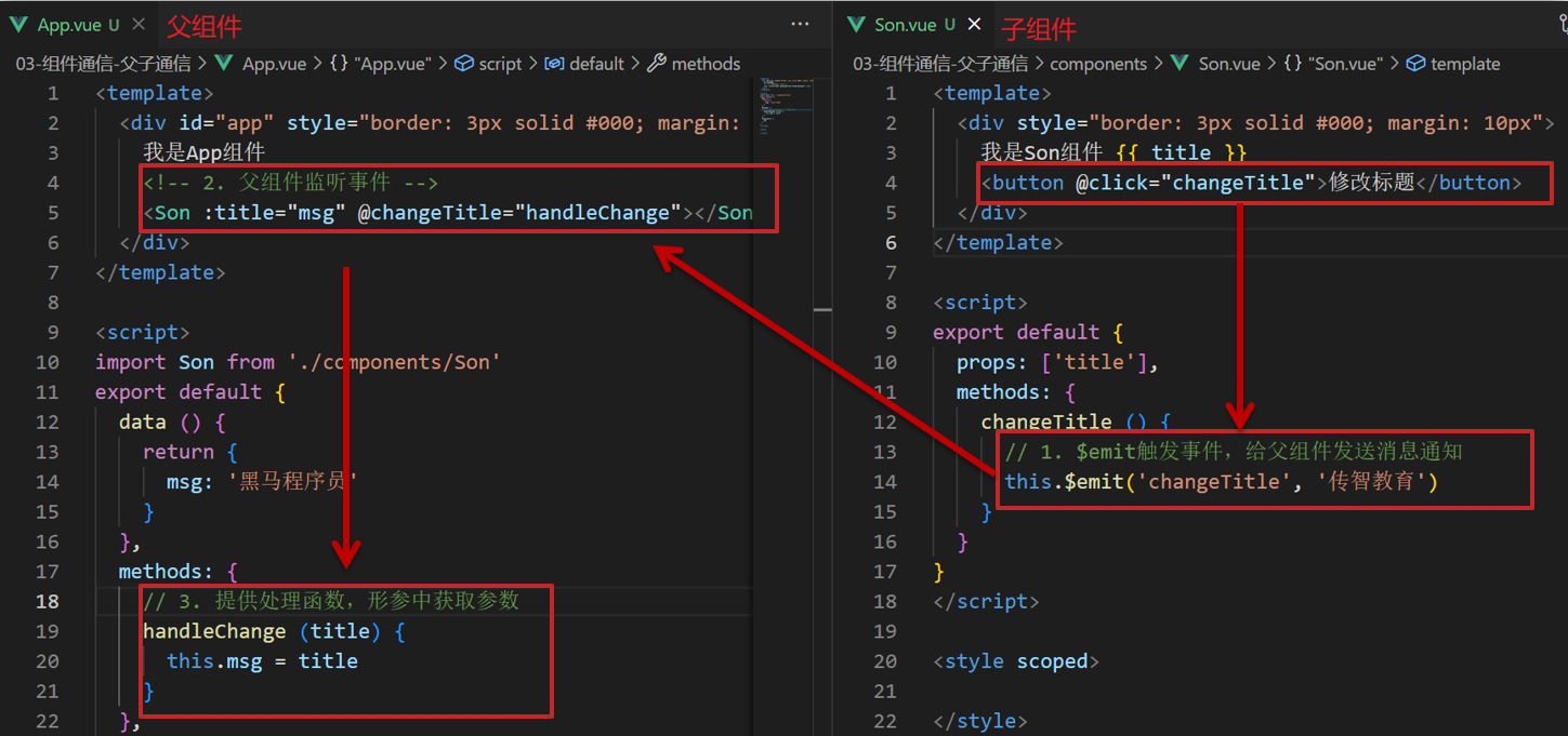
子向父传值步骤
- $emit触发事件,给父组件发送消息通知
- 父组件监听$emit触发的事件
- 提供处理函数,在函数的性参中获取传过来的参数
什么是props
Props 定义
组件上 注册的一些 自定义属性
Props 作用
向子组件传递数据
特点
- 可以 传递 任意数量 的prop
- 可以 传递 任意类型 的prop
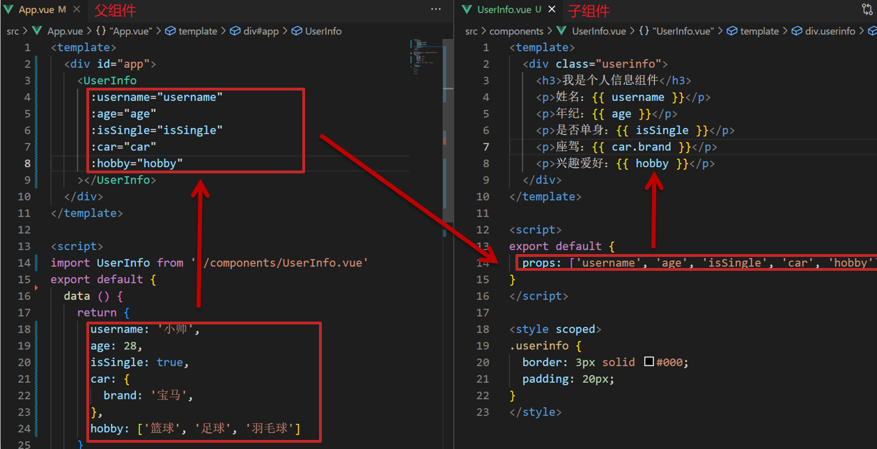
代码演示
父组件App.vue
<template>
  <div class="app">
    <UserInfo
      :username="username"
      :age="age"
      :isSingle="isSingle"
      :car="car"
      :hobby="hobby"
    ></UserInfo>
  </div>
</template>

<script>
import UserInfo from './components/UserInfo.vue'
export default {
  data() {
    return {
      username: '小帅',
      age: 28,
      isSingle: true,
      car: {
        brand: '宝马',
      },
      hobby: ['篮球', '足球', '羽毛球'],
    }
  },
  components: {
    UserInfo,
  },
}
</script>

<style>
</style>
子组件UserInfo.vue
<template>
  <div class="userinfo">
    <h3>我是个人信息组件</h3>
    <div>姓名:</div>
    <div>年龄:</div>
    <div>是否单身:</div>
    <div>座驾:</div>
    <div>兴趣爱好:</div>
  </div>
</template>

<script>
export default {

}
</script>

<style>
.userinfo {
  width: 300px;
  border: 3px solid #000;
  padding: 20px;
}
.userinfo > div {
  margin: 20px 10px;
}
</style>
props校验
思考
组件的props可以乱传吗
作用
为组件的 prop 指定验证要求,不符合要求,控制台就会有错误提示 → 帮助开发者,快速发现错误
语法
- 类型校验
- 非空校验
- 默认值
- 自定义校验

代码演示
App.vue
<template>
  <div class="app">
    <BaseProgress :w="width"></BaseProgress>
  </div>
</template>

<script>
import BaseProgress from './components/BaseProgress.vue'
export default {
  data() {
    return {
      width: 30,
    }
  },
  components: {
    BaseProgress,
  },
}
</script>

<style>
</style>
BaseProgress.vue
<template>
  <div class="base-progress">
    <div class="inner" :style="{ width: w + '%' }">
      <span>{{ w }}%</span>
    </div>
  </div>
</template>

<script>
export default {
  props: ['w'],
}
</script>

<style scoped>
.base-progress {
  height: 26px;
  width: 400px;
  border-radius: 15px;
  background-color: #272425;
  border: 3px solid #272425;
  box-sizing: border-box;
  margin-bottom: 30px;
}
.inner {
  position: relative;
  background: #379bff;
  border-radius: 15px;
  height: 25px;
  box-sizing: border-box;
  left: -3px;
  top: -2px;
}
.inner span {
  position: absolute;
  right: 0;
  top: 26px;
}
</style>
props校验完整写法
语法
props: {
  校验的属性名: {
    type: 类型,  // Number String Boolean ...
    required: true, // 是否必填
    default: 默认值, // 默认值
    validator (value) {
      // 自定义校验逻辑
      return 是否通过校验
    }
  }
},
代码实例
<script>
export default {
  // 完整写法(类型、默认值、非空、自定义校验)
  props: {
    w: {
      type: Number,
      //required: true,
      default: 0,
      validator(val) {
        // console.log(val)
        if (val >= 100 || val <= 0) {
          console.error('传入的范围必须是0-100之间')
          return false
        } else {
          return true
        }
      },
    },
  },
}
</script>
注意
-
default和required一般不同时写(因为当时必填项时,肯定是有值的)
-
default后面如果是简单类型的值,可以直接写默认。如果是复杂类型的值,则需要以函数的形式return一个默认值
props&data、单向数据流
共同点
都可以给组件提供数据
区别
- data 的数据是自己的 → 随便改
- prop 的数据是外部的 → 不能直接改,要遵循 单向数据流
单向数据流:
父级props 的数据更新,会向下流动,影响子组件。这个数据流动是单向的
代码演示
App.vue
<template>
  <div class="app">
    <BaseCount></BaseCount>
  </div>
</template>

<script>
import BaseCount from './components/BaseCount.vue'
export default {
  components:{
    BaseCount
  },
  data(){
  },
}
</script>

<style>

</style>
BaseCount.vue
<template>
  <div class="base-count">
    <button @click="count--">-</button>
    <span>{{ count }}</span>
    <button @click="count++">+</button>
  </div>
</template>

<script>
export default {
  // 1.自己的数据随便修改  (谁的数据 谁负责)
   data () {
     return {
       count: 100,
     }
   },
  // 2.外部传过来的数据 不能随便修改
  //props: {
  //  count: {
  //    type: Number,
  //  },
  //}
}
</script>

<style>
.base-count {
  margin: 20px;
}
</style>
综合案例-组件拆分
需求说明
- 拆分基础组件
- 渲染待办任务
- 添加任务
- 删除任务
- 底部合计 和 清空功能
- 持久化存储
拆分基础组件
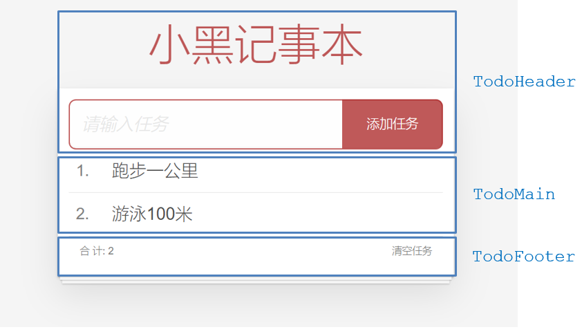
咱们可以把小黑记事本原有的结构拆成三部分内容:头部(TodoHeader)、列表(TodoMain)、底部(TodoFooter)
综合案例-列表渲染
思路分析:
- 提供数据:提供在公共的父组件 App.vue
- 通过父传子,将数据传递给TodoMain
- 利用v-for进行渲染
综合案例-添加功能
思路分析:
- 收集表单数据 v-model
- 监听时间 (回车+点击 都要进行添加)
- 子传父,将任务名称传递给父组件App.vue
- 父组件接受到数据后 进行添加 unshift(自己的数据自己负责)
综合案例-删除功能
思路分析:
- 监听时间(监听删除的点击)携带id
- 子传父,将删除的id传递给父组件App.vue
- 进行删除 filter (自己的数据自己负责)
综合案例-底部功能及持久化存储
思路分析:
- 底部合计:父组件传递list到底部组件 —>展示合计
- 清空功能:监听事件 —> 子组件通知父组件 —>父组件清空
- 持久化存储:watch监听数据变化,持久化到本地
非父子通信-event bus 事件总线
作用
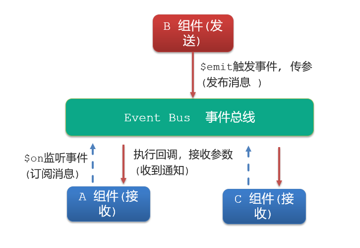
非父子组件之间,进行简易消息传递。(复杂场景→ Vuex)
步骤
-
创建一个都能访问的事件总线 (空Vue实例)
import Vue from 'vue' const Bus = new Vue() export default Bus -
A组件(接受方),监听Bus的 $on事件
created () { Bus.$on('sendMsg', (msg) => { this.msg = msg }) } -
B组件(发送方),触发Bus的$emit事件
Bus.$emit('sendMsg', '这是一个消息')
代码示例
EventBus.js
import Vue from 'vue'
const Bus  =  new Vue()
export default Bus
BaseA.vue(接受方)
<template>
  <div class="base-a">
    我是A组件(接收方)
    <p>{{msg}}</p>
  </div>
</template>

<script>
import Bus from '../utils/EventBus'
export default {
  data() {
    return {
      msg: '',
    }
  },
}
</script>

<style scoped>
.base-a {
  width: 200px;
  height: 200px;
  border: 3px solid #000;
  border-radius: 3px;
  margin: 10px;
}
</style>
BaseB.vue(发送方)
<template>
  <div class="base-b">
    <div>我是B组件(发布方)</div>
    <button>发送消息</button>
  </div>
</template>

<script>
import Bus from '../utils/EventBus'
export default {
}
</script>

<style scoped>
.base-b {
  width: 200px;
  height: 200px;
  border: 3px solid #000;
  border-radius: 3px;
  margin: 10px;
}
</style>
App.vue
<template>
  <div class="app">
    <BaseA></BaseA>
    <BaseB></BaseB>
  </div>
</template>

<script>
import BaseA from './components/BaseA.vue'
import BaseB from './components/BaseB.vue'
export default {
  components:{
    BaseA,
    BaseB
  }
}
</script>

<style>

</style>
非父子通信-provide&inject
作用
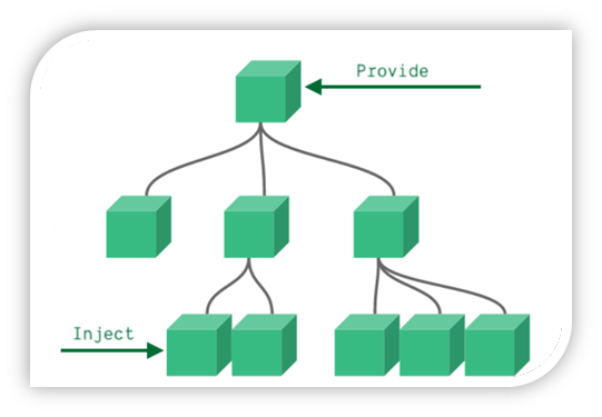
跨层级共享数据
场景
语法
- 父组件 provide提供数据
export default {
  provide () {
    return {
       // 普通类型【非响应式】
       color: this.color,
       // 复杂类型【响应式】
       userInfo: this.userInfo,
    }
  }
}
2.子/孙组件 inject获取数据
export default {
  inject: ['color','userInfo'],
  created () {
    console.log(this.color, this.userInfo)
  }
}
注意
- provide提供的简单类型的数据不是响应式的,复杂类型数据是响应式。(推荐提供复杂类型数据)
- 子/孙组件通过inject获取的数据,不能在自身组件内修改
v-model原理
原理:
v-model本质上是一个语法糖。例如应用在输入框上,就是value属性 和 input事件 的合写
<template>
  <div id="app" >
    <input v-model="msg" type="text">

    <input :value="msg" @input="msg = $event.target.value" type="text">
  </div>
</template>
作用:
提供数据的双向绑定
- 数据变,视图跟着变 :value
- 视图变,数据跟着变 @input
注意
$event 用于在模板中,获取事件的形参
代码示例
<template>
  <div class="app">
    <input type="text"  />
    <br />
    <input type="text" />
  </div>
</template>

<script>
export default {
  data() {
    return {
      msg1: '',
      msg2: '',
    }
  },
}
</script>
<style>
</style>
v-model使用在其他表单元素上的原理
不同的表单元素, v-model在底层的处理机制是不一样的。比如给checkbox使用v-model
底层处理的是 checked属性和change事件。
不过咱们只需要掌握应用在文本框上的原理即可
表单类组件封装
需求目标
实现子组件和父组件数据的双向绑定 (实现App.vue中的selectId和子组件选中的数据进行双向绑定)
代码演示
App.vue
<template>
  <div class="app">
    <BaseSelect></BaseSelect>
  </div>
</template>

<script>
import BaseSelect from './components/BaseSelect.vue'
export default {
  data() {
    return {
      selectId: '102',
    }
  },
  components: {
    BaseSelect,
  },
}
</script>

<style>
</style>
BaseSelect.vue
<template>
  <div>
    <select>
      <option value="101">北京</option>
      <option value="102">上海</option>
      <option value="103">武汉</option>
      <option value="104">广州</option>
      <option value="105">深圳</option>
    </select>
  </div>
</template>

<script>
export default {
}
</script>

<style>
</style>
v-model简化代码
目标:
父组件通过v-model 简化代码,实现子组件和父组件数据 双向绑定
如何简化:
v-model其实就是: value和@input事件的简写
- 子组件:props通过value接收数据,事件触发 input
- 父组件:v-model直接绑定数据
代码示例
子组件
<select :value="value" @change="handleChange">...</select>
props: {
  value: String
},
methods: {
  handleChange (e) {
    this.$emit('input', e.target.value)
  }
}
父组件
<BaseSelect v-model="selectId"></BaseSelect>
.sync修饰符
作用
可以实现 子组件 与 父组件数据 的 双向绑定,简化代码
简单理解:子组件可以修改父组件传过来的props值
场景
封装弹框类的基础组件, visible属性 true显示 false隐藏
本质
.sync修饰符 就是 :属性名 和 @update:属性名 合写
语法
父组件
//.sync写法
<BaseDialog :visible.sync="isShow" />
--------------------------------------
//完整写法
<BaseDialog
  :visible="isShow"
  @update:visible="isShow = $event"
/>
子组件
props: {
  visible: Boolean
},

this.$emit('update:visible', false)
5.代码示例
<template>
  <div class="app">
    <button @click="openDialog">退出按钮</button>
    <BaseDialog :isShow="isShow"></BaseDialog>
  </div>
</template>

<script>
import BaseDialog from './components/BaseDialog.vue'
export default {
  data() {
    return {
      isShow: false,
    }
  },
  components: {
    BaseDialog,
  },
}
</script>

<style>
</style>
BaseDialog.vue
<template>
  <div class="base-dialog-wrap" v-show="isShow">
    <div class="base-dialog">
      <div class="title">
        <h3>温馨提示:</h3>
        <button class="close">x</button>
      </div>
      <div class="content">
        <p>你确认要退出本系统么?</p>
      </div>
      <div class="footer">
        <button>确认</button>
        <button>取消</button>
      </div>
    </div>
  </div>
</template>

<script>
export default {
  props: {
    isShow: Boolean,
  }
}
</script>

<style scoped>
.base-dialog-wrap {
  width: 300px;
  height: 200px;
  box-shadow: 2px 2px 2px 2px #ccc;
  position: fixed;
  left: 50%;
  top: 50%;
  transform: translate(-50%, -50%);
  padding: 0 10px;
}
.base-dialog .title {
  display: flex;
  justify-content: space-between;
  align-items: center;
  border-bottom: 2px solid #000;
}
.base-dialog .content {
  margin-top: 38px;
}
.base-dialog .title .close {
  width: 20px;
  height: 20px;
  cursor: pointer;
  line-height: 10px;
}
.footer {
  display: flex;
  justify-content: flex-end;
  margin-top: 26px;
}
.footer button {
  width: 80px;
  height: 40px;
}
.footer button:nth-child(1) {
  margin-right: 10px;
  cursor: pointer;
}
</style>
ref和$refs
作用
利用ref 和 $refs 可以用于 获取 dom 元素 或 组件实例
特点:
查找范围 → 当前组件内(更精确稳定)
语法
1.给要获取的盒子添加ref属性
<div ref="chartRef">我是渲染图表的容器</div>
2.获取时通过 refs获取 this.\refs.chartRef 获取
mounted () {
  console.log(this.$refs.chartRef)
}
注意
之前只用document.querySelect('.box') 获取的是整个页面中的盒子
代码示例
App.vue
<template>
  <div class="app">
    <BaseChart></BaseChart>
  </div>
</template>

<script>
import BaseChart from './components/BaseChart.vue'
export default {
  components:{
    BaseChart
  }
}
</script>

<style>
</style>
BaseChart.vue
<template>
  <div class="base-chart-box" ref="baseChartBox">子组件</div>
</template>

<script>
// yarn add echarts 或者 npm i echarts
import * as echarts from 'echarts'

export default {
  mounted() {
    // 基于准备好的dom,初始化echarts实例
    var myChart = echarts.init(document.querySelect('.base-chart-box'))
    // 绘制图表
    myChart.setOption({
      title: {
        text: 'ECharts 入门示例',
      },
      tooltip: {},
      xAxis: {
        data: ['衬衫', '羊毛衫', '雪纺衫', '裤子', '高跟鞋', '袜子'],
      },
      yAxis: {},
      series: [
        {
          name: '销量',
          type: 'bar',
          data: [5, 20, 36, 10, 10, 20],
        },
      ],
    })
  },
}
</script>

<style scoped>
.base-chart-box {
  width: 400px;
  height: 300px;
  border: 3px solid #000;
  border-radius: 6px;
}
</style>
异步更新 & $nextTick
需求
编辑标题, 编辑框自动聚焦
- 点击编辑,显示编辑框
- 让编辑框,立刻获取焦点
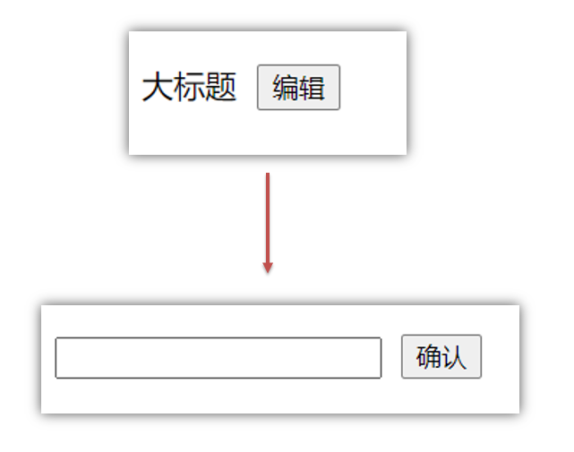
代码实现
<template>
  <div class="app">
    <div v-if="isShowEdit">
      <input type="text" v-model="editValue" ref="inp" />
      <button>确认</button>
    </div>
    <div v-else>
      <span>{{ title }}</span>
      <button @click="editFn">编辑</button>
    </div>
  </div>
</template>

<script>
export default {
  data() {
    return {
      title: '大标题',
      isShowEdit: false,
      editValue: '',
    }
  },
  methods: {
    editFn() {
        // 显示输入框
        this.isShowEdit = true
        // 获取焦点
        this.$refs.inp.focus()
    }  },
}
</script>
问题
"显示之后",立刻获取焦点是不能成功的!
原因:Vue 是异步更新DOM (提升性能)
解决方案
$nextTick:等 DOM更新后,才会触发执行此方法里的函数体
语法: this.$nextTick(函数体)
this.$nextTick(() => {
  this.$refs.inp.focus()
})
注意:$nextTick 内的函数体 一定是箭头函数,这样才能让函数内部的this指向Vue实例
5
自定义指令
指令介绍
-
内置指令:v-html、v-if、v-bind、v-on... 这都是Vue给咱们内置的一些指令,可以直接使用
-
自定义指令:同时Vue也支持让开发者,自己注册一些指令。这些指令被称为自定义指令
每个指令都有自己各自独立的功能
自定义指令
概念:自己定义的指令,可以封装一些DOM操作,扩展额外的功能
自定义指令语法
-
全局注册
//在main.js中 Vue.directive('指令名', { "inserted" (el) { // 可以对 el 标签,扩展额外功能 el.focus() } }) -
局部注册
//在Vue组件的配置项中 directives: { "指令名": { inserted () { // 可以对 el 标签,扩展额外功能 el.focus() } } } -
使用指令
注意:在使用指令的时候,一定要先注册,再使用,否则会报错 使用指令语法: v-指令名。如:
注册指令时不用加v-前缀,但使用时一定要加v-前缀
指令中的配置项介绍
inserted:被绑定元素插入父节点时调用的钩子函数
el:使用指令的那个DOM元素
代码示例
需求:当页面加载时,让元素获取焦点(autofocus在safari浏览器有兼容性)
App.vue
  <div>
    <h1>自定义指令</h1>
    <input v-focus ref="inp" type="text">
  </div>
自定义指令-指令的值
需求
实现一个 color 指令 - 传入不同的颜色, 给标签设置文字颜色
语法
- 在绑定指令时,可以通过“等号”的形式为指令 绑定 具体的参数值
<div v-color="color">我是内容</div>
- 通过 binding.value 可以拿到指令值,指令值修改会 触发 update 函数
directives: {
  color: {
    inserted (el, binding) {
      el.style.color = binding.value
    },
    update (el, binding) {
      el.style.color = binding.value
    }
  }
}
代码示例
App.vue
<template>
  <div>
     <!--显示红色-->
    <h2 v-color="color1">指令的值1测试</h2>
     <!--显示蓝色-->
    <h2 v-color="color2">指令的值2测试</h2>
     <button>
        改变第一个h1的颜色
    </button>
  </div>
</template>

<script>
export default {
  data () {
    return {
      color1: 'red',
      color2: 'blue'
    }
  }
}
</script>

<style>

</style>
自定义指令v-loading指令的封装
场景
实际开发过程中,发送请求需要时间,在请求的数据未回来时,页面会处于空白状态 => 用户体验不好
需求
封装一个 v-loading 指令,实现加载中的效果
分析
-
本质 loading效果就是一个蒙层,盖在了盒子上
-
数据请求中,开启loading状态,添加蒙层
-
数据请求完毕,关闭loading状态,移除蒙层
实现
-
准备一个 loading类,通过伪元素定位,设置宽高,实现蒙层
-
开启关闭 loading状态(添加移除蒙层),本质只需要添加移除类即可
-
结合自定义指令的语法进行封装复用
.loading:before {
  content: "";
  position: absolute;
  left: 0;
  top: 0;
  width: 100%;
  height: 100%;
  background: #fff url("./loading.gif") no-repeat center;
}
准备代码
<template>
  <div class="main">
    <div class="box">
      <ul>
        <li v-for="item in list" :key="item.id" class="news">
          <div class="left">
            <div class="title">{{ item.title }}</div>
            <div class="info">
              <span>{{ item.source }}</span>
              <span>{{ item.time }}</span>
            </div>
          </div>
          <div class="right">
            <img :src="item.img" alt="">
          </div>
        </li>
      </ul>
    </div>
  </div>
</template>

<script>
// 安装axios =>  yarn add axios || npm i axios
import axios from 'axios'

// 接口地址:http://hmajax.itheima.net/api/news
// 请求方式:get
export default {
  data () {
    return {
      list: [],
      isLoading: false,
      isLoading2: false
    }
  },
  async created () {
    // 1. 发送请求获取数据
    const res = await axios.get('http://hmajax.itheima.net/api/news')

    setTimeout(() => {
      // 2. 更新到 list 中,用于页面渲染 v-for
      this.list = res.data.data
    }, 2000)
  }
}
</script>

<style>
.loading:before {
  content: '';
  position: absolute;
  left: 0;
  top: 0;
  width: 100%;
  height: 100%;
  background: #fff url('./loading.gif') no-repeat center;
}

.box2 {
  width: 400px;
  height: 400px;
  border: 2px solid #000;
  position: relative;
}


.box {
  width: 800px;
  min-height: 500px;
  border: 3px solid orange;
  border-radius: 5px;
  position: relative;
}
.news {
  display: flex;
  height: 120px;
  width: 600px;
  margin: 0 auto;
  padding: 20px 0;
  cursor: pointer;
}
.news .left {
  flex: 1;
  display: flex;
  flex-direction: column;
  justify-content: space-between;
  padding-right: 10px;
}
.news .left .title {
  font-size: 20px;
}
.news .left .info {
  color: #999999;
}
.news .left .info span {
  margin-right: 20px;
}
.news .right {
  width: 160px;
  height: 120px;
}
.news .right img {
  width: 100%;
  height: 100%;
  object-fit: cover;
}
</style>
插槽-默认插槽
作用
让组件内部的一些 结构 支持 自定义
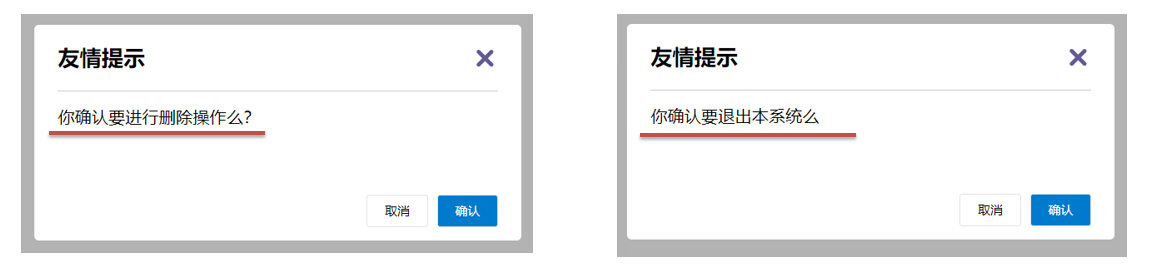
需求
将需要多次显示的对话框,封装成一个组件
问题
组件的内容部分,不希望写死,希望能使用的时候自定义。怎么办
插槽的基本语法
- 组件内需要定制的结构部分,改用****占位
- 使用组件时, ****标签内部, 传入结构替换slot
- 给插槽传入内容时,可以传入纯文本、html标签、组件
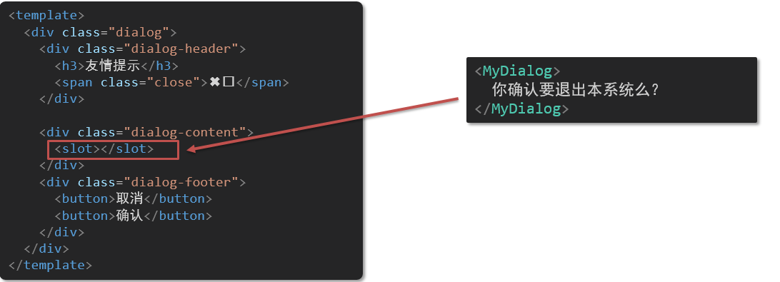
代码示例
MyDialog.vue
<template>
  <div class="dialog">
    <div class="dialog-header">
      <h3>友情提示</h3>
      <span class="close">✖️</span>
    </div>

    <div class="dialog-content">
      您确定要进行删除操作吗?
    </div>
    <div class="dialog-footer">
      <button>取消</button>
      <button>确认</button>
    </div>
  </div>
</template>

<script>
export default {
  data () {
    return {

    }
  }
}
</script>

<style scoped>
* {
  margin: 0;
  padding: 0;
}
.dialog {
  width: 470px;
  height: 230px;
  padding: 0 25px;
  background-color: #ffffff;
  margin: 40px auto;
  border-radius: 5px;
}
.dialog-header {
  height: 70px;
  line-height: 70px;
  font-size: 20px;
  border-bottom: 1px solid #ccc;
  position: relative;
}
.dialog-header .close {
  position: absolute;
  right: 0px;
  top: 0px;
  cursor: pointer;
}
.dialog-content {
  height: 80px;
  font-size: 18px;
  padding: 15px 0;
}
.dialog-footer {
  display: flex;
  justify-content: flex-end;
}
.dialog-footer button {
  width: 65px;
  height: 35px;
  background-color: #ffffff;
  border: 1px solid #e1e3e9;
  cursor: pointer;
  outline: none;
  margin-left: 10px;
  border-radius: 3px;
}
.dialog-footer button:last-child {
  background-color: #007acc;
  color: #fff;
}
</style>
App.vue
<template>
  <div>
    <MyDialog>
    </MyDialog>
  </div>
</template>

<script>
import MyDialog from './components/MyDialog.vue'
export default {
  data () {
    return {

    }
  },
  components: {
    MyDialog
  }
}
</script>

<style>
body {
  background-color: #b3b3b3;
}
</style>
插槽-后备内容(默认值)
问题
通过插槽完成了内容的定制,传什么显示什么, 但是如果不传,则是空白
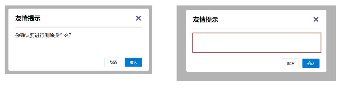
能否给插槽设置 默认显示内容 呢?
插槽的后备内容
封装组件时,可以为预留的 <slot> 插槽提供后备内容(默认内容)。
语法
在 标签内,放置内容, 作为默认显示内容
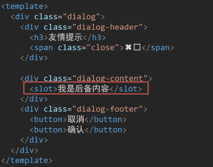
效果
- 外部使用组件时,不传东西,则slot会显示后备内容

- 外部使用组件时,传东西了,则slot整体会被换掉

代码示例
App.vue
<template>
  <div>
    <MyDialog></MyDialog>
    <MyDialog>
      你确认要退出么
    </MyDialog>
  </div>
</template>

<script>
import MyDialog from './components/MyDialog.vue'
export default {
  data () {
    return {

    }
  },
  components: {
    MyDialog
  }
}
</script>

<style>
body {
  background-color: #b3b3b3;
}
</style>
插槽-具名插槽
需求
一个组件内有多处结构,需要外部传入标签,进行定制 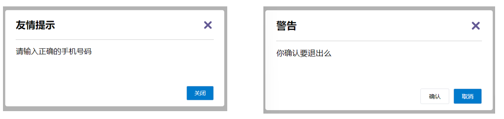
上面的弹框中有三处不同,但是默认插槽只能定制一个位置,这时候怎么办呢?
具名插槽语法
- 多个slot使用name属性区分名字
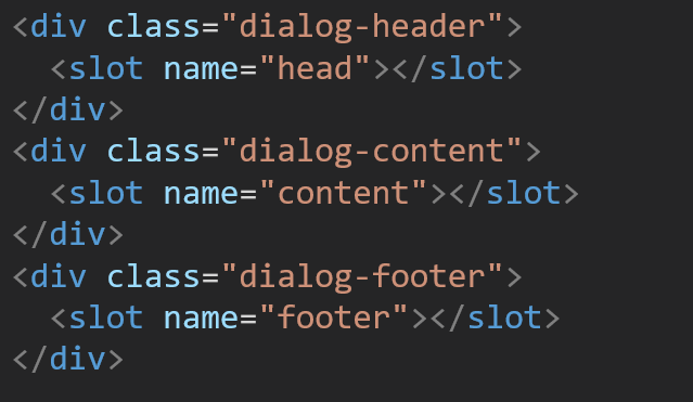
- template配合v-slot:名字来分发对应标签
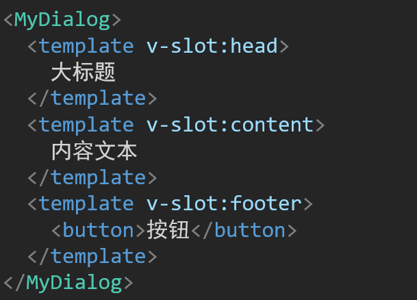
v-slot的简写
v-slot写起来太长,vue给我们提供一个简单写法 v-slot —> #
作用域插槽
插槽分类
-
默认插槽
-
具名插槽
插槽只有两种,作用域插槽不属于插槽的一种分类
作用
定义slot 插槽的同时, 是可以传值的。给 插槽 上可以 绑定数据,将来 使用组件时可以用
场景
封装表格组件
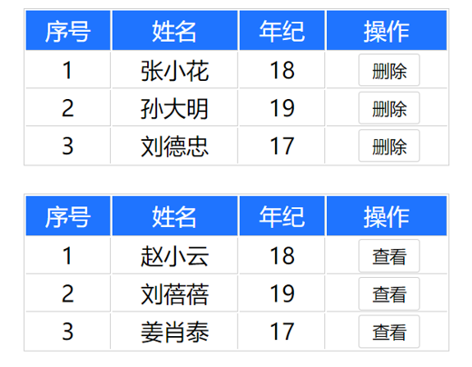
使用步骤
-
给 slot 标签, 以 添加属性的方式传值
<slot :id="item.id" msg="测试文本"></slot> -
所有添加的属性, 都会被收集到一个对象中
{ id: 3, msg: '测试文本' } -
在template中, 通过
#插槽名= "obj"接收,默认插槽名为 default<MyTable :list="list"> <template #default="obj"> <button @click="del(obj.id)">删除</button> </template> </MyTable>
代码示例
MyTable.vue
<template>
  <table class="my-table">
    <thead>
      <tr>
        <th>序号</th>
        <th>姓名</th>
        <th>年纪</th>
        <th>操作</th>
      </tr>
    </thead>
    <tbody>
      <tr>
        <td>1</td>
        <td>赵小云</td>
        <td>19</td>
        <td>
          <button>
          	查看
    	  </button>
        </td>
      </tr>
        <tr>
        <td>1</td>
        <td>张小花</td>
        <td>19</td>
        <td>
          <button>
          	查看
    	  </button>
        </td>
      </tr>
        <tr>
        <td>1</td>
        <td>孙大明</td>
        <td>19</td>
        <td>
          <button>
          	查看
    	  </button>
        </td>
      </tr>
    </tbody>
  </table>
</template>

<script>
export default {
  props: {
    data: Array
  }
}
</script>

<style scoped>
.my-table {
  width: 450px;
  text-align: center;
  border: 1px solid #ccc;
  font-size: 24px;
  margin: 30px auto;
}
.my-table thead {
  background-color: #1f74ff;
  color: #fff;
}
.my-table thead th {
  font-weight: normal;
}
.my-table thead tr {
  line-height: 40px;
}
.my-table th,
.my-table td {
  border-bottom: 1px solid #ccc;
  border-right: 1px solid #ccc;
}
.my-table td:last-child {
  border-right: none;
}
.my-table tr:last-child td {
  border-bottom: none;
}
.my-table button {
  width: 65px;
  height: 35px;
  font-size: 18px;
  border: 1px solid #ccc;
  outline: none;
  border-radius: 3px;
  cursor: pointer;
  background-color: #ffffff;
  margin-left: 5px;
}
</style>
App.vue
<template>
  <div>
    <MyTable :data="list"></MyTable>
    <MyTable :data="list2"></MyTable>
  </div>
</template>

<script>
  import MyTable from './components/MyTable.vue'
  export default {
    data () {
      return {
     	list: [
            { id: 1, name: '张小花', age: 18 },
            { id: 2, name: '孙大明', age: 19 },
            { id: 3, name: '刘德忠', age: 17 },
          ],
          list2: [
            { id: 1, name: '赵小云', age: 18 },
            { id: 2, name: '刘蓓蓓', age: 19 },
            { id: 3, name: '姜肖泰', age: 17 },
          ]
      }
    },
    components: {
      MyTable
    }
  }
</script>
综合案例 - 商品列表-MyTag组件抽离
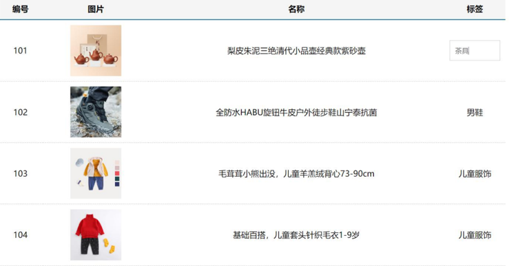
需求说明
-
my-tag 标签组件封装
(1) 双击显示输入框,输入框获取焦点
(2) 失去焦点,隐藏输入框
(3) 回显标签信息
(4) 内容修改,回车 → 修改标签信息
-
my-table 表格组件封装
(1) 动态传递表格数据渲染
(2) 表头支持用户自定义
(3) 主体支持用户自定义
代码准备
<template>
  <div class="table-case">
    <table class="my-table">
      <thead>
        <tr>
          <th>编号</th>
          <th>名称</th>
          <th>图片</th>
          <th width="100px">标签</th>
        </tr>
      </thead>
      <tbody>
        <tr>
          <td>1</td>
          <td>梨皮朱泥三绝清代小品壶经典款紫砂壶</td>
          <td>
            <img src="https://yanxuan-item.nosdn.127.net/f8c37ffa41ab1eb84bff499e1f6acfc7.jpg" />
          </td>
          <td>
            <div class="my-tag">
              <!-- <input
                class="input"
                type="text"
                placeholder="输入标签"
              /> -->
              <div class="text">
                茶具
              </div>
            </div>
          </td>
        </tr>
        <tr>
          <td>1</td>
          <td>梨皮朱泥三绝清代小品壶经典款紫砂壶</td>
          <td>
            <img src="https://yanxuan-item.nosdn.127.net/221317c85274a188174352474b859d7b.jpg" />
          </td>
          <td>
            <div class="my-tag">
              <!-- <input
                ref="inp"
                class="input"
                type="text"
                placeholder="输入标签"
              /> -->
              <div class="text">
                男靴
              </div>
            </div>
          </td>
        </tr>
      </tbody>
    </table>
  </div>
</template>

<script>
export default {
  name: 'TableCase',
  components: {},
  data() {
    return {
      goods: [
        {
          id: 101,
          picture:
            'https://yanxuan-item.nosdn.127.net/f8c37ffa41ab1eb84bff499e1f6acfc7.jpg',
          name: '梨皮朱泥三绝清代小品壶经典款紫砂壶',
          tag: '茶具',
        },
        {
          id: 102,
          picture:
            'https://yanxuan-item.nosdn.127.net/221317c85274a188174352474b859d7b.jpg',
          name: '全防水HABU旋钮牛皮户外徒步鞋山宁泰抗菌',
          tag: '男鞋',
        },
        {
          id: 103,
          picture:
            'https://yanxuan-item.nosdn.127.net/cd4b840751ef4f7505c85004f0bebcb5.png',
          name: '毛茸茸小熊出没,儿童羊羔绒背心73-90cm',
          tag: '儿童服饰',
        },
        {
          id: 104,
          picture:
            'https://yanxuan-item.nosdn.127.net/56eb25a38d7a630e76a608a9360eec6b.jpg',
          name: '基础百搭,儿童套头针织毛衣1-9岁',
          tag: '儿童服饰',
        },
      ],
    }
  },
}
</script>

<style lang="less" scoped>
.table-case {
  width: 1000px;
  margin: 50px auto;
  img {
    width: 100px;
    height: 100px;
    object-fit: contain;
    vertical-align: middle;
  }

  .my-table {
    width: 100%;
    border-spacing: 0;
    img {
      width: 100px;
      height: 100px;
      object-fit: contain;
      vertical-align: middle;
    }
    th {
      background: #f5f5f5;
      border-bottom: 2px solid #069;
    }
    td {
      border-bottom: 1px dashed #ccc;
    }
    td,
    th {
      text-align: center;
      padding: 10px;
      transition: all 0.5s;
      &.red {
        color: red;
      }
    }
    .none {
      height: 100px;
      line-height: 100px;
      color: #999;
    }
  }
  .my-tag {
    cursor: pointer;
    .input {
      appearance: none;
      outline: none;
      border: 1px solid #ccc;
      width: 100px;
      height: 40px;
      box-sizing: border-box;
      padding: 10px;
      color: #666;
      &::placeholder {
        color: #666;
      }
    }
  }
}
</style>
my-tag组件封装-创建组件
MyTag.vue
<template>
  <div class="my-tag">
  <!--  <input
      class="input"
      type="text"
      placeholder="输入标签"
    /> -->
    <div
      class="text">
       茶具
    </div>
  </div>
</template>

<script>
export default {

}
</script>

<style lang="less" scoped>
.my-tag {
  cursor: pointer;
  .input {
    appearance: none;
    outline: none;
    border: 1px solid #ccc;
    width: 100px;
    height: 40px;
    box-sizing: border-box;
    padding: 10px;
    color: #666;
    &::placeholder {
      color: #666;
    }
  }
}
</style>
App.vue
<template>
  ...
 <tbody>
       <tr>
          ....
          <td>
            <MyTag></MyTag>
          </td>
       </tr>
 </tbody>
 ...
</template>
<script>
import MyTag from './components/MyTag.vue'
export default {
  name: 'TableCase',
  components: {
    MyTag,
  },
 ....
 </script>
综合案例-MyTag组件控制显示隐藏
MyTag.vue
<template>
  <div class="my-tag">
    <input
      v-if="isEdit"
      v-focus
      ref="inp"
      class="input"
      type="text"
      placeholder="输入标签"
      @blur="isEdit = false"
    />
    <div
      v-else
      @dblclick="handleClick"
      class="text">
       茶具
    </div>
  </div>
</template>

<script>
export default {
  data () {
    return {
      isEdit: false
    }
  },
  methods: {
    handleClick () {
      this.isEdit = true
    }
  }
}
</script>
main.js
// 封装全局指令 focus
Vue.directive('focus', {
  // 指令所在的dom元素,被插入到页面中时触发
  inserted (el) {
    el.focus()
  }
})
综合案例-MyTag组件进行v-model绑定
App.vue
<MyTag v-model="tempText"></MyTag>
<script>
    export default {
        data(){
            tempText:'水杯'
        }
    }
</script>
MyTag.vue
<template>
  <div class="my-tag">
    <input
      v-if="isEdit"
      v-focus
      ref="inp"
      class="input"
      type="text"
      placeholder="输入标签"
      :value="value"
      @blur="isEdit = false"
      @keyup.enter="handleEnter"
    />
    <div
      v-else
      @dblclick="handleClick"
      class="text">
      {{ value }}
    </div>
  </div>
</template>

<script>
export default {
  props: {
    value: String
  },
  data () {
    return {
      isEdit: false
    }
  },
  methods: {
    handleClick () {
      this.isEdit = true
    },
    handleEnter (e) {
      // 非空处理
      if (e.target.value.trim() === '') return alert('标签内容不能为空')
      this.$emit('input', e.target.value)
      // 提交完成,关闭输入状态
      this.isEdit = false
    }
  }
}
</script>
综合案例-封装MyTable组件-动态渲染数据
App.vue
<template>
  <div class="table-case">
    <MyTable :data="goods"></MyTable>
  </div>
</template>

<script>
import MyTable from './components/MyTable.vue'
export default {
  name: 'TableCase',
  components: {
    MyTable
  },
  data(){
    return {
        ....
    }
  },
}
</script>
MyTable.vue
<template>
  <table class="my-table">
    <thead>
      <tr>
        <th>编号</th>
        <th>名称</th>
        <th>图片</th>
        <th width="100px">标签</th>
      </tr>
    </thead>
    <tbody>
      <tr v-for="(item, index) in data" :key="item.id">
       <td>{{ index + 1 }}</td>
        <td>{{ item.name }}</td>
        <td>
          <img
            :src="item.picture"
          />
        </td>
        <td>
          标签内容
         <!-- <MyTag v-model="item.tag"></MyTag> -->
        </td>
      </tr>
    </tbody>
  </table>
</template>

<script>
export default {
  props: {
    data: {
      type: Array,
      required: true
    }
  }
};
</script>

<style lang="less" scoped>

.my-table {
  width: 100%;
  border-spacing: 0;
  img {
    width: 100px;
    height: 100px;
    object-fit: contain;
    vertical-align: middle;
  }
  th {
    background: #f5f5f5;
    border-bottom: 2px solid #069;
  }
  td {
    border-bottom: 1px dashed #ccc;
  }
  td,
  th {
    text-align: center;
    padding: 10px;
    transition: all .5s;
    &.red {
      color: red;
    }
  }
  .none {
    height: 100px;
    line-height: 100px;
    color: #999;
  }
}

</style>
综合案例-封装MyTable组件-自定义结构
App.vue
<template>
  <div class="table-case">
    <MyTable :data="goods">
      <template #head>
        <th>编号</th>
        <th>名称</th>
        <th>图片</th>
        <th width="100px">标签</th>
      </template>

      <template #body="{ item, index }">
        <td>{{ index + 1 }}</td>
        <td>{{ item.name }}</td>
        <td>
          <img
            :src="item.picture"
          />
        </td>
        <td>
          <MyTag v-model="item.tag"></MyTag>
        </td>
      </template>
    </MyTable>
  </div>
</template>

<script>
import MyTag from './components/MyTag.vue'
import MyTable from './components/MyTable.vue'
export default {
  name: 'TableCase',
  components: {
    MyTag,
    MyTable
  },
  data () {
    return {
      ....
  }
}
</script>
MyTable.vue
<template>
  <table class="my-table">
    <thead>
      <tr>
        <slot name="head"></slot>
      </tr>
    </thead>
    <tbody>
      <tr v-for="(item, index) in data" :key="item.id">
        <slot name="body" :item="item" :index="index" ></slot>
      </tr>
    </tbody>
  </table>
</template>

<script>
export default {
  props: {
    data: {
      type: Array,
      required: true
    }
  }
};
</script>
单页应用程序介绍
概念
单页应用程序:SPA【Single Page Application】是指所有的功能都在一个html页面上实现
具体示例
单页应用网站: 网易云音乐 https://music.163.com/
多页应用网站:京东 https://jd.com/
单页应用 VS 多页面应用
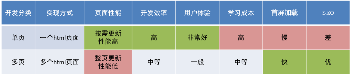
单页应用类网站:系统类网站 / 内部网站 / 文档类网站 / 移动端站点
多页应用类网站:公司官网 / 电商类网站
路由介绍
思考
单页面应用程序,之所以开发效率高,性能好,用户体验好
最大的原因就是:页面按需更新
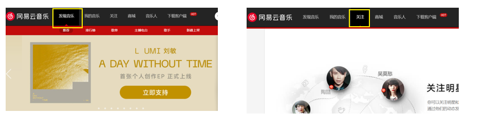
比如当点击【发现音乐】和【关注】时,只是更新下面部分内容,对于头部是不更新的
要按需更新,首先就需要明确:访问路径和 组件的对应关系!
访问路径 和 组件的对应关系如何确定呢? 路由
路由的介绍
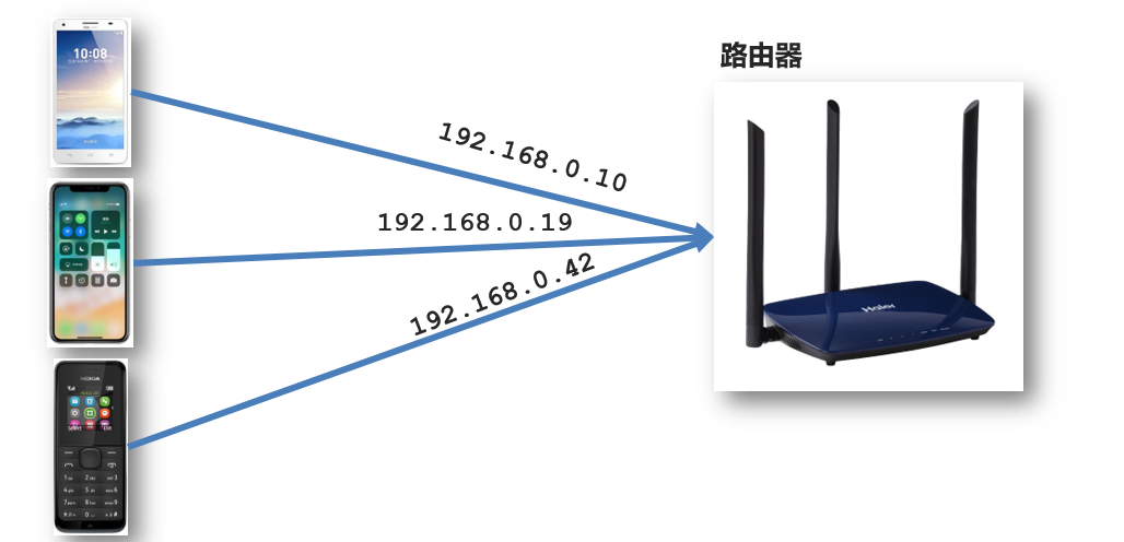
生活中的路由:设备和ip的映射关系
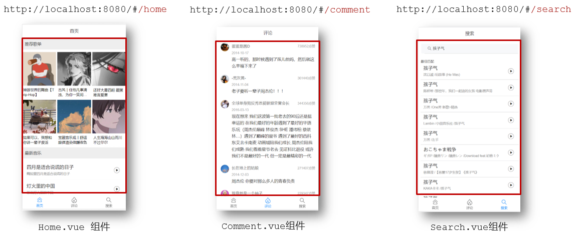
Vue中的路由:路径和组件的映射关系
路由的基本使用
目标
认识插件 VueRouter,掌握 VueRouter 的基本使用步骤
作用
修改地址栏路径时,切换显示匹配的组件
说明
Vue 官方的一个路由插件,是一个第三方包
官网
https://v3.router.vuejs.org/zh/
VueRouter的使用(5+2)
固定5个固定的步骤(不用死背,熟能生巧)
-
下载 VueRouter 模块到当前工程,版本3.6.5
yarn add vue-router@3.6.5 -
main.js中引入VueRouter
import VueRouter from 'vue-router' -
安装注册
Vue.use(VueRouter) -
创建路由对象
const router = new VueRouter() -
注入,将路由对象注入到new Vue实例中,建立关联
new Vue({
  render: h => h(App),
  router:router
}).$mount('#app')
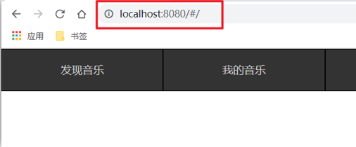
当我们配置完以上5步之后 就可以看到浏览器地址栏中的路由 变成了 /#/的形式。表示项目的路由已经被Vue-Router管理了
代码示例
main.js
// 路由的使用步骤 5 + 2
// 5个基础步骤
// 1. 下载 v3.6.5
// yarn add vue-router@3.6.5
// 2. 引入
// 3. 安装注册 Vue.use(Vue插件)
// 4. 创建路由对象
// 5. 注入到new Vue中,建立关联


import VueRouter from 'vue-router'
Vue.use(VueRouter) // VueRouter插件初始化

const router = new VueRouter()

new Vue({
  render: h => h(App),
  router
}).$mount('#app')
两个核心步骤
- 创建需要的组件 (views目录),配置路由规则
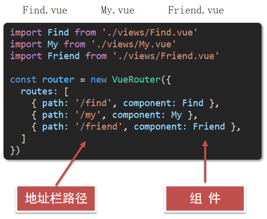
- 配置导航,配置路由出口(路径匹配的组件显示的位置)
App.vue
<div class="footer_wrap">
  <a href="#/find">发现音乐</a>
  <a href="#/my">我的音乐</a>
  <a href="#/friend">朋友</a>
</div>
<div class="top">
  <router-view></router-view>
</div>
组件的存放目录问题
注意: .vue文件 本质无区别
组件分类
.vue文件分为2类,都是 .vue文件(本质无区别)
- 页面组件 (配置路由规则时使用的组件)
- 复用组件(多个组件中都使用到的组件)
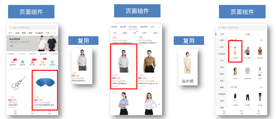
存放目录
分类开来的目的就是为了 更易维护
-
src/views文件夹
页面组件 - 页面展示 - 配合路由用
-
src/components文件夹
复用组件 - 展示数据 - 常用于复用
路由的封装抽离
问题:所有的路由配置都在main.js中合适吗?
目标:将路由模块抽离出来。 好处:拆分模块,利于维护
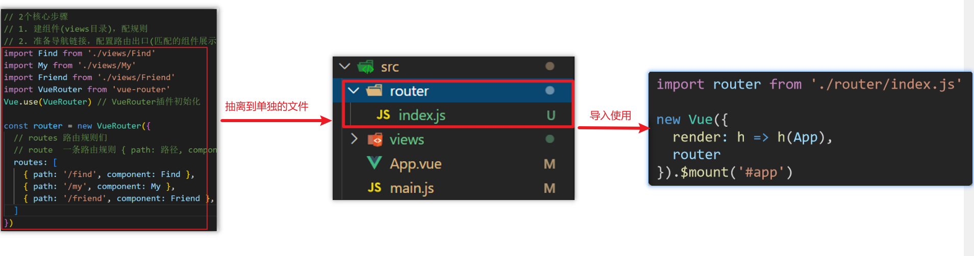
路径简写:
脚手架环境下 @指代src目录,可以用于快速引入组件
6
声明式导航-导航链接
需求
实现导航高亮效果
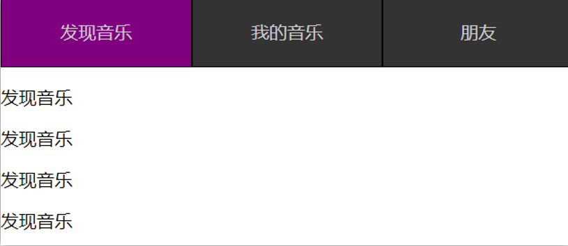
如果使用a标签进行跳转的话,需要给当前跳转的导航加样式,同时要移除上一个a标签的样式,太麻烦!!!
解决方案
vue-router 提供了一个全局组件 router-link (取代 a 标签)
- 能跳转,配置 to 属性指定路径(必须) 。本质还是 a 标签 ,to 无需 #
- 能高亮,默认就会提供高亮类名,可以直接设置高亮样式
语法: 发现音乐
  <div>
    <div class="footer_wrap">
      <router-link to="/find">发现音乐</router-link>
      <router-link to="/my">我的音乐</router-link>
      <router-link to="/friend">朋友</router-link>
    </div>
    <div class="top">
      <!-- 路由出口 → 匹配的组件所展示的位置 -->
      <router-view></router-view>
    </div>
  </div>
通过router-link自带的两个样式进行高亮
使用router-link跳转后,我们发现。当前点击的链接默认加了两个class的值 router-link-exact-active和router-link-active
我们可以给任意一个class属性添加高亮样式即可实现功能
声明式导航-两个类名
当我们使用跳转时,自动给当前导航加了两个类名

router-link-active
模糊匹配(用的多)
to="/my" 可以匹配 /my /my/a /my/b ....
只要是以/my开头的路径 都可以和 to="/my"匹配到
router-link-exact-active
精确匹配
to="/my" 仅可以匹配 /my
在地址栏中输入二级路由查看类名的添加
声明式导航-自定义类名(了解)
问题
router-link的两个高亮类名 太长了,我们希望能定制怎么办

解决方案
我们可以在创建路由对象时,额外配置两个配置项即可。 linkActiveClass和linkExactActiveClass
const router = new VueRouter({
  routes: [...],
  linkActiveClass: "类名1",
  linkExactActiveClass: "类名2"
})

代码演示
// 创建了一个路由对象
const router = new VueRouter({
  routes: [
    ...
  ],
  linkActiveClass: 'active', // 配置模糊匹配的类名
  linkExactActiveClass: 'exact-active' // 配置精确匹配的类名
})
声明式导航-查询参数传参
目标
在跳转路由时,进行传参
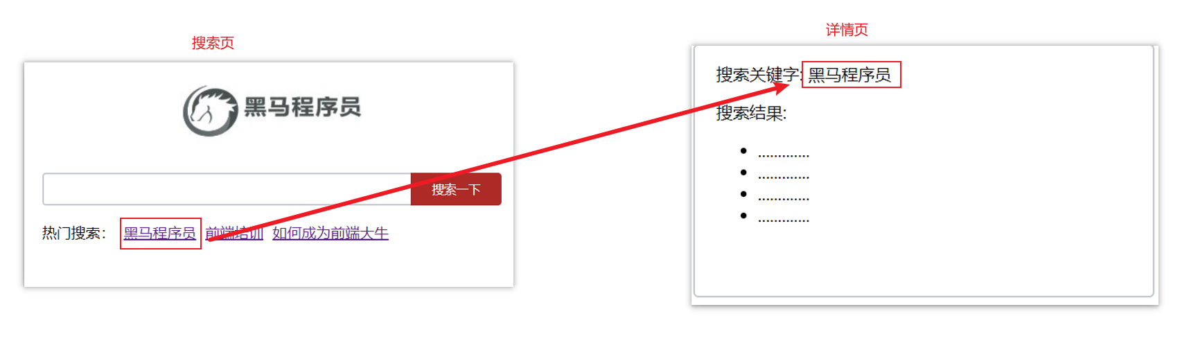
比如:现在我们在搜索页点击了热门搜索链接,跳转到详情页,需要把点击的内容带到详情页,改怎么办呢?
跳转传参
我们可以通过两种方式,在跳转的时候把所需要的参数传到其他页面中
- 查询参数传参
- 动态路由传参
查询参数传参
-
如何传参?
-
如何接受参数
固定用法:$router.query.参数名
代码演示
App.vue
<template>
  <div id="app">
    <div class="link">
      <router-link to="/home">首页</router-link>
      <router-link to="/search">搜索页</router-link>
    </div>

    <router-view></router-view>
  </div>
</template>

<script>
export default {};
</script>

<style scoped>
.link {
  height: 50px;
  line-height: 50px;
  background-color: #495150;
  display: flex;
  margin: -8px -8px 0 -8px;
  margin-bottom: 50px;
}
.link a {
  display: block;
  text-decoration: none;
  background-color: #ad2a26;
  width: 100px;
  text-align: center;
  margin-right: 5px;
  color: #fff;
  border-radius: 5px;
}
</style>
Home.vue
<template>
  <div class="home">
    <div class="logo-box"></div>
    <div class="search-box">
      <input type="text">
      <button>搜索一下</button>
    </div>
    <div class="hot-link">
      热门搜索:
      <router-link to="">黑马程序员</router-link>
      <router-link to="">前端培训</router-link>
      <router-link to="">如何成为前端大牛</router-link>
    </div>
  </div>
</template>

<script>
export default {
  name: 'FindMusic'
}
</script>

<style>
.logo-box {
  height: 150px;
  background: url('@/assets/logo.jpeg') no-repeat center;
}
.search-box {
  display: flex;
  justify-content: center;
}
.search-box input {
  width: 400px;
  height: 30px;
  line-height: 30px;
  border: 2px solid #c4c7ce;
  border-radius: 4px 0 0 4px;
  outline: none;
}
.search-box input:focus {
  border: 2px solid #ad2a26;
}
.search-box button {
  width: 100px;
  height: 36px;
  border: none;
  background-color: #ad2a26;
  color: #fff;
  position: relative;
  left: -2px;
  border-radius: 0 4px 4px 0;
}
.hot-link {
  width: 508px;
  height: 60px;
  line-height: 60px;
  margin: 0 auto;
}
.hot-link a {
  margin: 0 5px;
}
</style>
Search.vue
<template>
  <div class="search">
    <p>搜索关键字: 黑马程序员</p>
    <p>搜索结果: </p>
    <ul>
      <li>.............</li>
      <li>.............</li>
      <li>.............</li>
      <li>.............</li>
    </ul>
  </div>
</template>

<script>
export default {
  name: 'MyFriend',
  created () {
    // 在created中,获取路由参数
  }
}
</script>

<style>
.search {
  width: 400px;
  height: 240px;
  padding: 0 20px;
  margin: 0 auto;
  border: 2px solid #c4c7ce;
  border-radius: 5px;
}
</style>
router/index.js
import Home from '@/views/Home'
import Search from '@/views/Search'
import Vue from 'vue'
import VueRouter from 'vue-router'
Vue.use(VueRouter) // VueRouter插件初始化

// 创建了一个路由对象
const router = new VueRouter({
  routes: [
    { path: '/home', component: Home },
    { path: '/search', component: Search }
  ]
})

export default router
main.js
...
import router from './router/index'
...
new Vue({
  render: h => h(App),
  router
}).$mount('#app')
声明式导航-动态路由传参
动态路由传参方式
-
配置动态路由
动态路由后面的参数可以随便起名,但要有语义
const router = new VueRouter({ routes: [ ..., { path: '/search/:words', component: Search } ] }) -
配置导航链接
to="/path/参数值"
-
对应页面组件接受参数
$route.params.参数名
params后面的参数名要和动态路由配置的参数保持一致
查询参数传参 VS 动态路由传参
1 . 查询参数传参 (比较适合传多个参数)
- 跳转:to="/path?参数名=值&参数名2=值"
- 获取:$route.query.参数名
2 . 动态路由传参 (优雅简洁,传单个参数比较方便)
- 配置动态路由:path: "/path/:参数名"
- 跳转:to="/path/参数值"
- 获取:$route.params.参数名
注意:动态路由也可以传多个参数,但一般只传一个
动态路由参数的可选符(了解)
问题
配了路由 path:"/search/:words" 为什么按下面步骤操作,会未匹配到组件,显示空白?
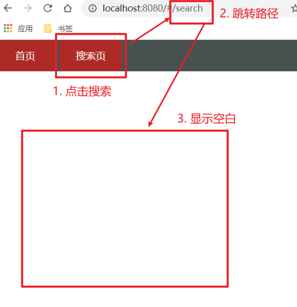
原因
/search/:words 表示,必须要传参数。如果不传参数,也希望匹配,可以加个可选符"?"
const router = new VueRouter({
  routes: [
 	...
    { path: '/search/:words?', component: Search }
  ]
})
Vue路由-重定向
问题
网页打开时, url 默认是 / 路径,未匹配到组件时,会出现空白
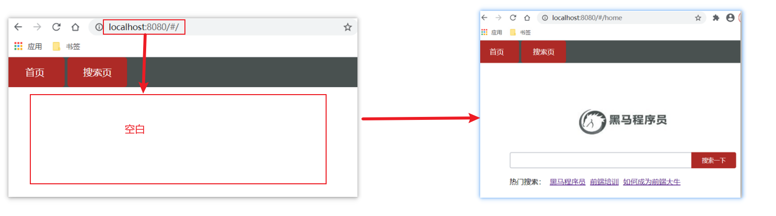
解决方案
重定向 → 匹配 / 后, 强制跳转 /home 路径
语法
{ path: 匹配路径, redirect: 重定向到的路径 },
比如:
{ path:'/' ,redirect:'/home' }
代码演示
const router = new VueRouter({
  routes: [
    { path: '/', redirect: '/home'},
 	 ...
  ]
})
Vue路由-404
作用
当路径找不到匹配时,给个提示页面
位置
404的路由,虽然配置在任何一个位置都可以,但一般都配置在其他路由规则的最后面
语法
path: "*" (任意路径) – 前面不匹配就命中最后这个
import NotFind from '@/views/NotFind'

const router = new VueRouter({
  routes: [
    ...
    { path: '*', component: NotFind } //最后一个
  ]
})
代码示例
NotFound.vue
<template>
  <div>
    <h1>404 Not Found</h1>
  </div>
</template>

<script>
export default {

}
</script>

<style>

</style>
router/index.js
...
import NotFound from '@/views/NotFound'
...

// 创建了一个路由对象
const router = new VueRouter({
  routes: [
     ...
    { path: '*', component: NotFound }
  ]
})

export default router
Vue路由-模式设置
问题
路由的路径看起来不自然, 有#,能否切成真正路径形式?
- hash路由(默认) 例如: http://localhost:8080/#/home
- history路由(常用) 例如: http://localhost:8080/home (以后上线需要服务器端支持,开发环境webpack给规避掉了history模式的问题)
语法
const router = new VueRouter({
    mode:'histroy', //默认是hash
    routes:[]
})
编程式导航-两种路由跳转方式
问题
点击按钮跳转如何实现?
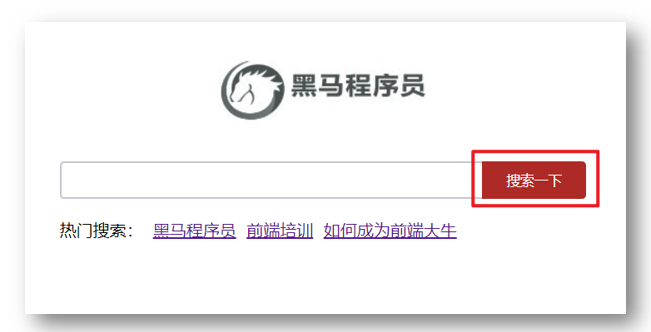
方案
编程式导航:用JS代码来进行跳转
语法
两种语法:
- path 路径跳转 (简易方便)
- name 命名路由跳转 (适合 path 路径长的场景)
path路径跳转语法
特点:简易方便
//简单写法
this.$router.push('路由路径')

//完整写法
this.$router.push({
  path: '路由路径'
})
代码演示 path跳转方式
name命名路由跳转
特点:适合 path 路径长的场景
语法:
-
路由规则,必须配置name配置项
{ name: '路由名', path: '/path/xxx', component: XXX }, -
通过name来进行跳转
this.$router.push({
  name: '路由名'
})
代码演示通过name命名路由跳转
编程式导航-path路径跳转传参
问题
点击搜索按钮,跳转需要把文本框中输入的内容传到下一个页面如何实现?
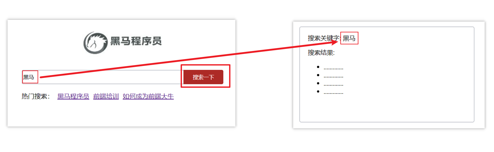
两种传参方式
-
查询参数
-
动态路由传参
传参
两种跳转方式,对于两种传参方式都支持:
① path 路径跳转传参
② name 命名路由跳转传参
path路径跳转传参(query传参)
//简单写法
this.$router.push('/路径?参数名1=参数值1&参数2=参数值2')
//完整写法
this.$router.push({
  path: '/路径',
  query: {
    参数名1: '参数值1',
    参数名2: '参数值2'
  }
})
接受参数的方式依然是:$route.query.参数名
path路径跳转传参(动态路由传参)
//简单写法
this.$router.push('/路径/参数值')
//完整写法
this.$router.push({
  path: '/路径/参数值'
})
接受参数的方式依然是:$route.params.参数值
**注意:**path不能配合params使用
编程式导航-name命名路由传参
name 命名路由跳转传参 (query传参)
this.$router.push({
  name: '路由名字',
  query: {
    参数名1: '参数值1',
    参数名2: '参数值2'
  }
})
name 命名路由跳转传参 (动态路由传参)
this.$router.push({
  name: '路由名字',
  params: {
    参数名: '参数值',
  }
})
总结
编程式导航,如何跳转传参?
1.path路径跳转
-
query传参
this.$router.push('/路径?参数名1=参数值1&参数2=参数值2') this.$router.push({ path: '/路径', query: { 参数名1: '参数值1', 参数名2: '参数值2' } }) -
动态路由传参
this.$router.push('/路径/参数值')
this.$router.push({
  path: '/路径/参数值'
})
2.name命名路由跳转
-
query传参
this.$router.push({ name: '路由名字', query: { 参数名1: '参数值1', 参数名2: '参数值2' } }) -
动态路由传参 (需要配动态路由)
this.$router.push({
  name: '路由名字',
  params: {
    参数名: '参数值',
  }
})
面经基础版-案例效果分析
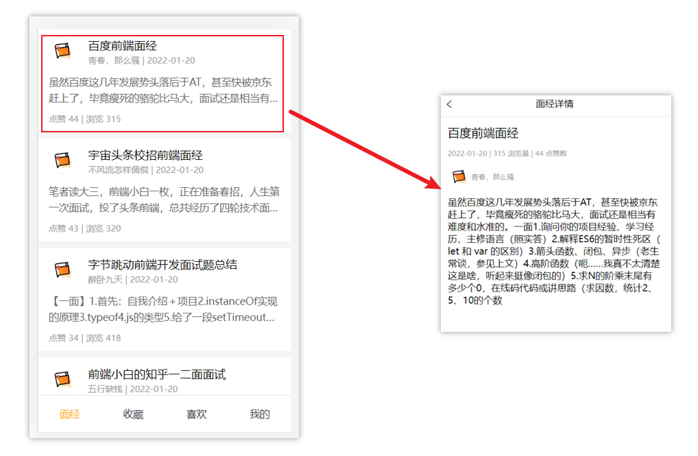
面经效果演示
功能分析
- 通过演示效果发现,主要的功能页面有两个,一个是列表页,一个是详情页,并且在列表页点击时可以跳转到详情页
- 底部导航可以来回切换,并且切换时,只有上面的主题内容在动态渲染
实现思路分析:配置路由+功能实现
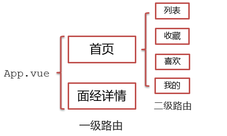
- 配置路由
- 首页和面经详情页,两个一级路由
- 首页内嵌套4个可切换的页面(嵌套二级路由)
- 实现功能
- 首页请求渲染
- 跳转传参 到 详情页,详情页动态渲染
- 组件缓存,性能优化
面经基础版-一级路由配置
-
把文档中准备的素材拷贝到项目中
-
针对router/index.js文件 进行一级路由配置
...
import Layout from '@/views/Layout.vue'
import ArticleDetail from '@/views/ArticleDetail.vue'
...


const router = new VueRouter({
  routes: [
    {
      path: '/',
      redirect: '/home'
    },
    {
      path: '/home',
      component: Layout
    },
    {
      path: '/detail',
      component: ArticleDetail
    }
  ]
})
面经基础版-二级路由配置
二级路由也叫嵌套路由,当然也可以嵌套三级、四级...
使用场景
当在页面中点击链接跳转,只是部分内容切换时,我们可以使用嵌套路由
语法
- 在一级路由下,配置children属性即可
- 配置二级路由的出口
- 在一级路由下,配置children属性
注意:一级的路由path 需要加 / 二级路由的path不需要加 /
const router = new VueRouter({
  routes: [
    {
      path: '/home',
      component: Layout,
      children:[
        //children中的配置项 跟一级路由中的配置项一模一样
        {path:'xxxx',component:xxxx.vue},
        {path:'xxxx',component:xxxx.vue},
      ]
    }
  ]
})
技巧:二级路由应该配置到哪个一级路由下呢?
这些二级路由对应的组件渲染到哪个一级路由下,children就配置到哪个路由下边
- 配置二级路由的出口
注意: 配置了嵌套路由,一定配置对应的路由出口,否则不会渲染出对应的组件
Layout.vue
<template>
  <div class="h5-wrapper">
    <div class="content">
      <router-view></router-view>
    </div>
  ....
  </div>
</template>
代码实现
router/index.js
...
import Article from '@/views/Article.vue'
import Collect from '@/views/Collect.vue'
import Like from '@/views/Like.vue'
import User from '@/views/User.vue'
...

const router = new VueRouter({
  routes: [
    {
      path: '/',
      redirect: '/home/article'
    },
    {
      path: '/home',
      component: Layout,
      children:[
        {
          path:'article',
          component:Article
        },
        {
          path:'collect',
          component:Collect
        },
        {
          path:'like',
          component:Like
        },
        {
          path:'user',
          component:User
        }
      ]
    },
    ....
  ]
})
Layout.vue
<template>
  <div class="h5-wrapper">
    <div class="content">
      <!-- 内容部分 -->
      <router-view></router-view>
    </div>
    <nav class="tabbar">
      <a href="#/home/article">面经</a>
      <a href="#/home/collect">收藏</a>
      <a href="#/home/like">喜欢</a>
      <a href="#/home/user">我的</a>
    </nav>
  </div>
</template>
面经基础版-二级导航高亮
实现思路
- 将a标签替换成 组件,配置to属性,不用加 #
- 结合高亮类名实现高亮效果 (推荐模糊匹配:router-link-active)
代码实现
Layout.vue
....
    <nav class="tabbar">
      <router-link to="/home/article">面经</router-link>
      <router-link to="/home/collect">收藏</router-link>
      <router-link to="/home/like">喜欢</router-link>
      <router-link to="/home/user">我的</router-link>
    </nav>

<style>
   a.router-link-active {
      color: orange;
    }
</style>
面经基础版-首页请求渲染
步骤分析
-
安装axios
-
看接口文档,确认请求方式,请求地址,请求参数
-
created中发送请求,获取数据,存储到data中
-
页面动态渲染
代码实现
- 安装axios
yarn add axios npm i axios
- 接口文档
请求地址: https://mock.boxuegu.com/mock/3083/articles
请求方式: get
- created中发送请求,获取数据,存储到data中
 data() {
    return {
      articelList: [],
    }
  },
  async created() {
    const {  data: { result: { rows } }} = await axios.get('https://mock.boxuegu.com/mock/3083/articles')
    this.articelList = rows
  },
- 页面动态渲染
<template>
  <div class="article-page">
    <div class="article-item" v-for="item in articelList" :key="item.id">
      <div class="head">
        <img :src="item.creatorAvatar" alt="" />
        <div class="con">
          <p class="title">{{ item.stem }}</p>
          <p class="other">{{ item.creatorName }} | {{ item.createdAt }}</p>
        </div>
      </div>
      <div class="body">
        {{item.content}}
      </div>
      <div class="foot">点赞 {{item.likeCount}} | 浏览 {{item.views}}</div>
    </div>
  </div>
</template>
面经基础版-查询参数传参
说明
跳转详情页需要把当前点击的文章id传给详情页,获取数据
- 查询参数传参 this.$router.push('/detail?参数1=参数值&参数2=参数值')
- 动态路由传参 先改造路由 在传参 this.$router.push('/detail/参数值')
查询参数传参实现
Article.vue
<template>
  <div class="article-page">
    <div class="article-item"
      v-for="item in articelList" :key="item.id"
      @click="$router.push(`/detail?id=${item.id}`)">
     ...
    </div>
  </div>
</template>
ArticleDetail.vue
  created(){
    console.log(this.$route.query.id)
  }
面经基础版-动态路由传参
实现步骤
- 改造路由
- 动态传参
- 在详情页获取参数
代码实现
改造路由
router/index.js
...
  {
      path: '/detail/:id',
      component: ArticleDetail
  }
Article.vue
<div class="article-item"
     v-for="item in articelList" :key="item.id"
     @click="$router.push(`/detail/${item.id}`)">
       ....
 </div>
ArticleDetail.vue
  created(){
    console.log(this.$route.params.id)
  }
额外优化一个功能-点击回退跳转到上一页
ArticleDetail.vue
<template>
<div class="article-detail-page">
<nav class="nav"><span class="back" @click="$router.back()"><</span> 面经详情</nav>
....
</div>
</template>
面经基础版-详情页渲染
实现步骤分析
- 导入axios
- 查看接口文档
- 在created中发送请求
- 页面动态渲染
代码实现
接口文档
 请求地址: https://mock.boxuegu.com/mock/3083/articles/:id
 请求方式: get
在created中发送请求
 data() {
    return {
      articleDetail:{}
    }
  },
  async created() {
    const id = this.$route.params.id
    const {data:{result}} = await axios.get(
      `https://mock.boxuegu.com/mock/3083/articles/${id}`
    )
    this.articleDetail = result
  },
页面动态渲染
<template>
<div class="article-detail-page">
<nav class="nav">
<span class="back" @click="$router.back()"><</span> 面经详情
</nav>
<header class="header">
<h1>{{articleDetail.stem}}</h1>
<p>{{articleDetail.createAt}} | {{articleDetail.views}} 浏览量 | {{articleDetail.likeCount}} 点赞数</p>
<p>
<img
:src="articleDetail.creatorAvatar"
alt=""
/>
<span>{{articleDetail.creatorName}}</span>
</p>
</header>
<main class="body">
{{articleDetail.content}}
</main>
</div>
</template>
面经基础版-缓存组件
问题
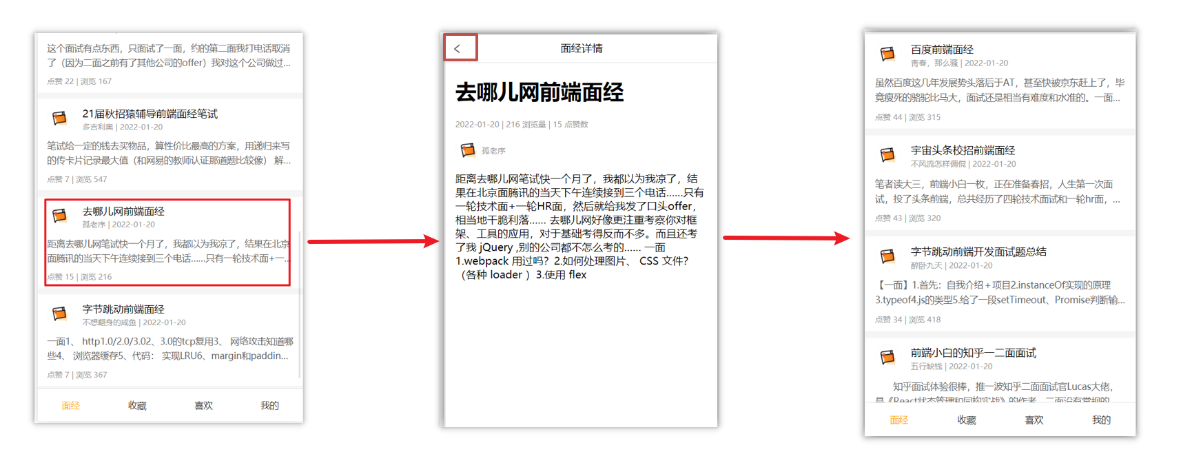
从面经列表 点到 详情页,又点返回,数据重新加载了 → 希望回到原来的位置
原因
当路由被跳转后,原来所看到的组件就被销毁了(会执行组件内的beforeDestroy和destroyed生命周期钩子),重新返回后组件又被重新创建了(会执行组件内的beforeCreate,created,beforeMount,Mounted生命周期钩子),所以数据被加载了
解决方案
利用keep-alive把原来的组件给缓存下来
什么是keep-alive
keep-alive 是 Vue 的内置组件,当它包裹动态组件时,会缓存不活动的组件实例,而不是销毁它们。
keep-alive 是一个抽象组件:它自身不会渲染成一个 DOM 元素,也不会出现在父组件中。
优点:
在组件切换过程中把切换出去的组件保留在内存中,防止重复渲染DOM,
减少加载时间及性能消耗,提高用户体验性。
App.vue
<template>
  <div class="h5-wrapper">
    <keep-alive>
      <router-view></router-view>
    </keep-alive>
  </div>
</template>
问题:
缓存了所有被切换的组件
keep-alive的三个属性
① include : 组件名数组,只有匹配的组件会被缓存
② exclude : 组件名数组,任何匹配的组件都不会被缓存
③ max : 最多可以缓存多少组件实例
App.vue
<template>
  <div class="h5-wrapper">
    <keep-alive :include="['LayoutPage']">
      <router-view></router-view>
    </keep-alive>
  </div>
</template>
额外的两个生命周期钩子
keep-alive的使用会触发两个生命周期函数
activated 当组件被激活(使用)的时候触发 → 进入这个页面的时候触发
deactivated 当组件不被使用的时候触发 → 离开这个页面的时候触发
组件缓存后就不会执行组件的created, mounted, destroyed 等钩子了
所以其提供了actived 和deactived钩子,帮我们实现业务需求。
VueCli 自定义创建项目
- 安装脚手架 (已安装)
npm i @vue/cli -g
- 创建项目
vue create hm-exp-mobile
- 选项
Vue CLI v5.0.8
? Please pick a preset:
  Default ([Vue 3] babel, eslint)
  Default ([Vue 2] babel, eslint)
> Manually select features     选自定义
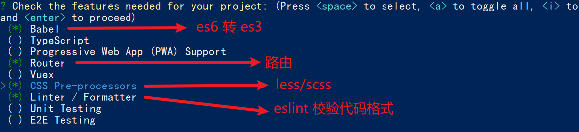
- 手动选择功能
- 选择vue的版本
  3.x
> 2.x
- 是否使用history模式

- 选择css预处理

- 选择eslint的风格 (eslint 代码规范的检验工具,检验代码是否符合规范)
- 比如:const age = 18; => 报错!多加了分号!后面有工具,一保存,全部格式化成最规范的样子
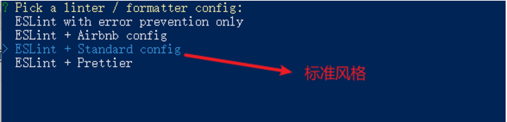
- 选择校验的时机 (直接回车)

- 选择配置文件的生成方式 (直接回车)

- 是否保存预设,下次直接使用? => 不保存,输入 N
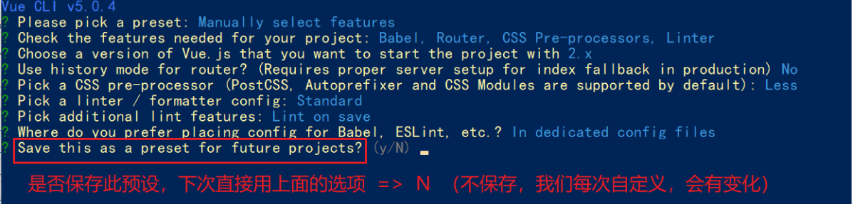
- 等待安装,项目初始化完成
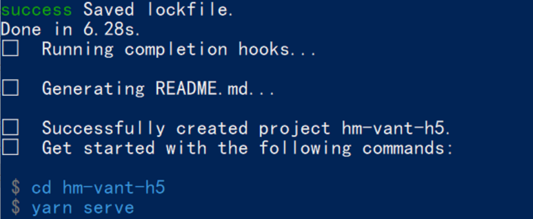
- 启动项目
npm run serve
ESlint代码规范及手动修复
代码规范:一套写代码的约定规则。例如:赋值符号的左右是否需要空格?一句结束是否是要加;?...
没有规矩不成方圆
ESLint:是一个代码检查工具,用来检查你的代码是否符合指定的规则(你和你的团队可以自行约定一套规则)。在创建项目时,我们使用的是 JavaScript Standard Style 代码风格的规则。
JavaScript Standard Style 规范说明
建议把:https://standardjs.com/rules-zhcn.html 看一遍,然后在写的时候, 遇到错误就查询解决。
下面是这份规则中的一小部分:
- 字符串使用单引号 – 需要转义的地方除外
- 无分号 – 这没什么不好。不骗你!
- 关键字后加空格
if (condition) { ... } - 函数名后加空格
function name (arg) { ... } - 坚持使用全等
===摒弃==一但在需要检查null || undefined时可以使用obj == null - ......
代码规范错误
如果你的代码不符合standard的要求,eslint会跳出来刀子嘴,豆腐心地提示你。
下面我们在main.js中随意做一些改动:添加一些空行,空格。
import Vue from 'vue'
import App from './App.vue'

import './styles/index.less'
import router from './router'
Vue.config.productionTip = false

new Vue ( {
  render: h => h(App),
  router
}).$mount('#app')
按下保存代码之后:
你将会看在控制台中输出如下错误:

eslint 是来帮助你的。心态要好,有错,就改。
手动修正
根据错误提示来一项一项手动修正。
如果你不认识命令行中的语法报错是什么意思,你可以根据错误代码(func-call-spacing, space-in-parens,.....)去 ESLint 规则列表中查找其具体含义。
打开 ESLint 规则表,使用页面搜索(Ctrl + F)这个代码,查找对该规则的一个释义。
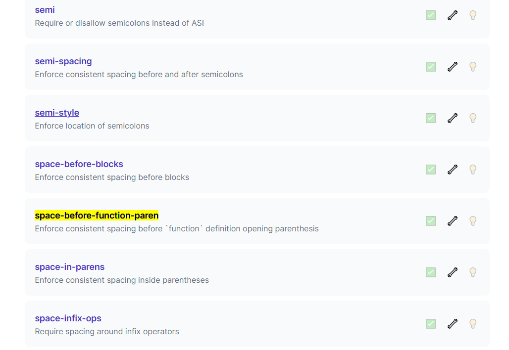
通过eslint插件来实现自动修正
- eslint会自动高亮错误显示
- 通过配置,eslint会自动帮助我们修复错误
- 如何安装

- 如何配置
// 当保存的时候,eslint自动帮我们修复错误
"editor.codeActionsOnSave": {
    "source.fixAll": true
},
// 保存代码,不自动格式化
"editor.formatOnSave": false
- 注意:eslint的配置文件必须在根目录下,这个插件才能才能生效。打开项目必须以根目录打开,一次打开一个项目
- 注意:使用了eslint校验之后,把vscode带的那些格式化工具全禁用了 Beatify
settings.json 参考
{
    "window.zoomLevel": 2,
    "workbench.iconTheme": "vscode-icons",
    "editor.tabSize": 2,
    "emmet.triggerExpansionOnTab": true,
    // 当保存的时候,eslint自动帮我们修复错误
    "editor.codeActionsOnSave": {
        "source.fixAll": true
    },
    // 保存代码,不自动格式化
    "editor.formatOnSave": false
}